Visit Jackson Hole
01 // Project Overview
A New Hub for Sustainable Tourism
When the Jackson Hole Travel & Tourism Board (TTB) sought proposals for a new website, the team at TMBR kicked into high gear preparing to take on the project we had all been waiting for. As a team of local Jackson Hole outdoor enthusiasts, we had seen the increase in tourism over the last decade, and some of the negative effects that it had on the region. It really was a dream project for us, and with our previous experience with dozens of local clients in the hospitality and outdoor industry, TMBR was the right choice to provide a new web experience grounded on the idea of educating users about sustainable tourism.
02 // Sitemap & Information Architecture
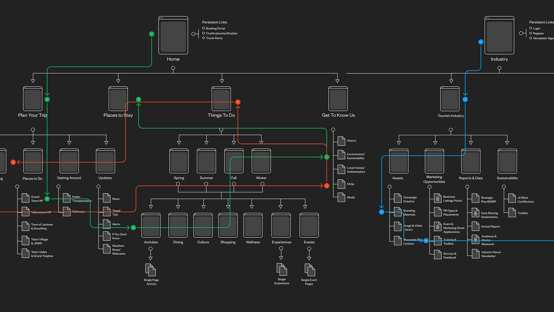
Navigating Multiple User Groups
In addition to providing visitors with a wealth of information for the Jackson Hole region, the site also needed to serve as a hub for locals and local businesses to access resources from the TTB. Providing a subdomain for the tourism industry resources and allowing a switch between the sides in the navigation kept those user segments separate and created clear paths to booking for visitors.

03 // Team Collaboration
A Group Effort
Figma’s collaborative tools allowed the full TMBR team to weigh in through the UX process ensuring that vision of the project was being executed. Keeping tabs on feedback allowed me to roll the full team’s vision into the UX design process.


04 // UX Design & Wireframes
Welcoming the User to Jackson Hole
Building upon the user research and almost a decade of experience with tourism websites, I moved into creating wireframes for dozens of screens across the site. Following a guideline that each page should inspire, educate and motivate, I created a flow that guided the user through an experience as inspiring as Jackson Hole itself. Keeping in mind the priority to encourage sustainable tourism practices across all visitor groups, I wove sustainable tips throughout the content of the entire site, where that message would be most impactful, instead of keeping it restricted to its own single section.
05 // UX Highlight
Guiding the User Journey
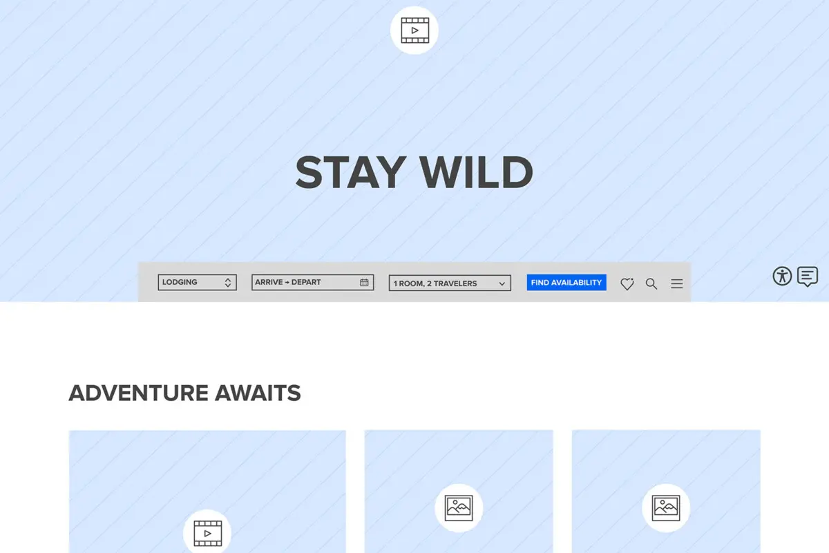
In the UX design process, I introduced the idea of a toolbar that would follow the user throughout the journey and give them access to flight and hotel booking, navigation and the ability to save experiences that inspired them.

06 // Continued Collaboration
Seeing the Vision come to Life
Throughout the UI design and web development process, I consulted with the team to ensure the intent of each page on the site was being carried through to the final product. Truly a full team effort from TMBR, this site was an inspiring project to work on.