Alpenglow Expeditions
01 // Project Overview
Elevating a Premier Guiding Experience
Alpenglow Expeditions has steadily rose to the top mountain guiding companies in the world and needed to update their web presence to reflect their elite status. Their unique approach combining epic experiences with a sustainable travel ethos sets them apart from other guiding companies, and emphasizing that approach throughout the content of the website would make them stand out from the competition online as well. They came to TMBR to provide and intuitive and exciting new website that motivated user to book the trip of a lifetime.
02 // Information Architecture & Sitemap
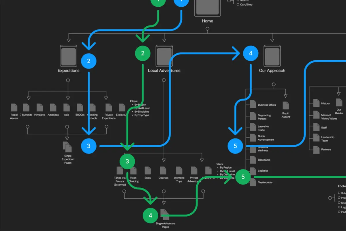
Balancing Local Adventures & Global Expeditions
Leveraging our experience with other mountain guiding companies, I developed a sitemap and navigation that showcased the wide offerings from Alpenglow Expeditions. The challenge was to effectively cater to their two distinct user groups: US based climbers looking for beginner to intermediate adventures close to home, and expert level mountaineers ready to travel around the globe. The new structure ensured that both segments had intuitive paths to booking trips with Alpenglow.

03 // UX Design & Wireframes
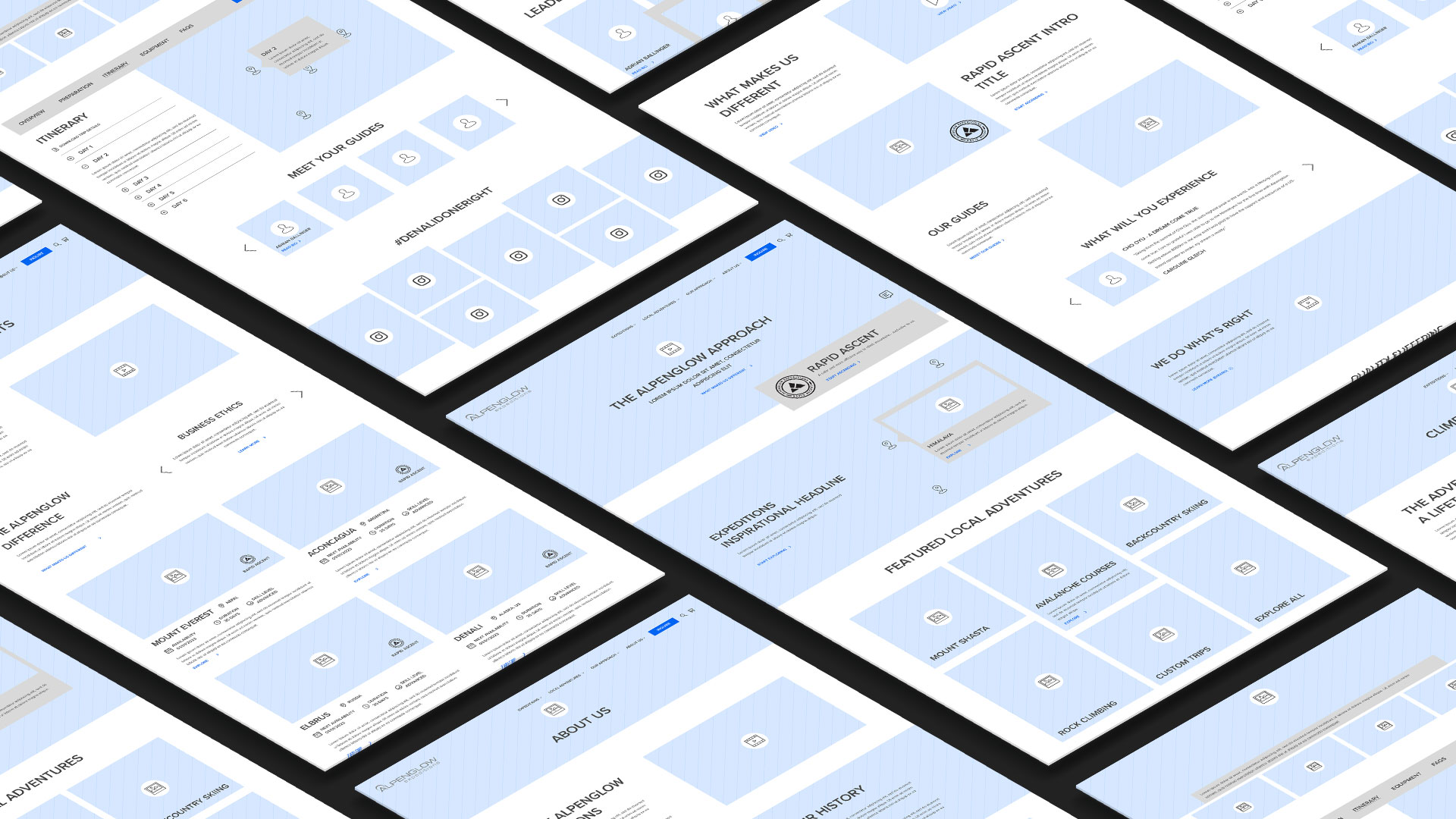
Guiding the User Experience
For the next step in the UX process, I prototyped dozens of screens across the site to create wireframes that would serve as the blueprints of content structure and user flow. Providing a pacing to content that progressively discloses information as the user digs deeper into the trip ensures that each user groups were not overwhelmed unnecessary content. Weaving together Alpenglow’s unique approach, epic adventures, testimonials and guide bios with their epic visual assets created a an experience that inspires and motivates the user book the adventure of a lifetime.

04 // UX Design Highlight
Flexible layouts for Adventures
The individual expeditions pages needed to handle extensive information and be customizable for each unique trip. We designed these pages with flexible components that can be added, removed, mixed and matched to fit each unique trip landing page. Also providing an in page navigation allows the user to jump between sections to quickly move into the content that mattered the most to them.
05 // Continued Collaboration
Seeing it Through
Throughout the project, I worked closely with the UI designer and web developer to ensure that the prototypes were accurately followed. This collaboration ensured a seamless transition from design to development, maintaining the intention and functionality of the final website